Explore UI Libraries
Choose a library to get started
Filter by Tags
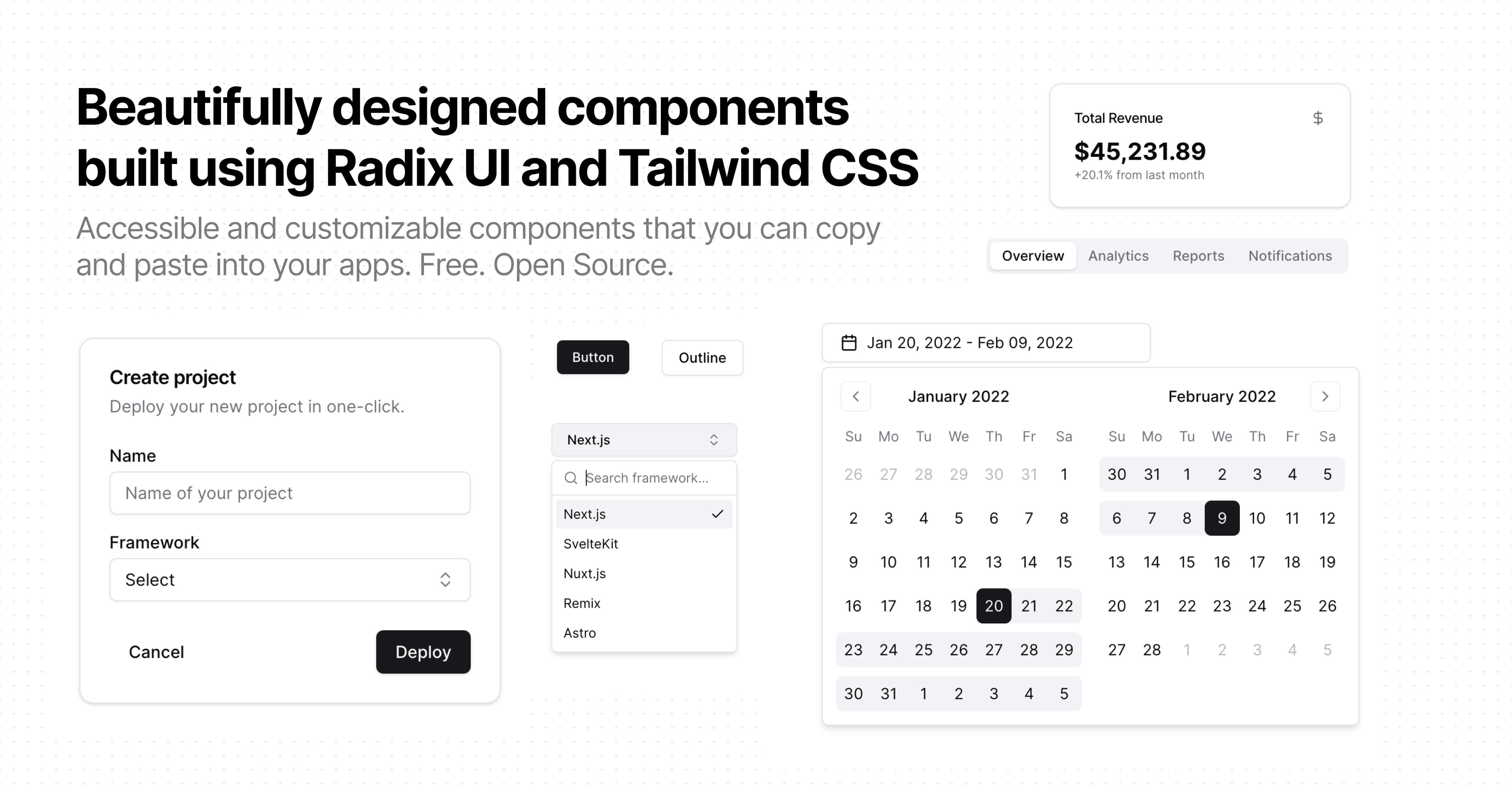
Shadcn UI
A collection of pre-built, themeable React + Tailwind components — super easy to customize and fits perfectly with modern stacks.
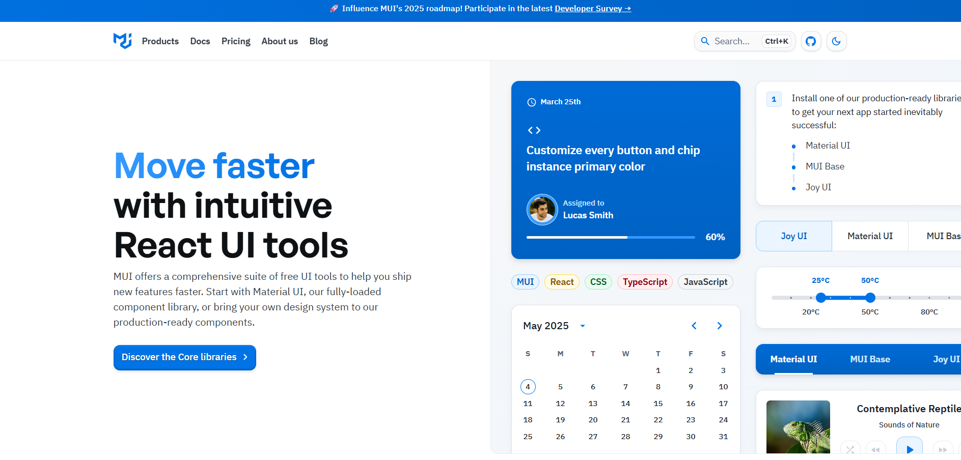
Material UI
A set of polished React components that follow Google's Material Design — great for dashboards or clean UIs.
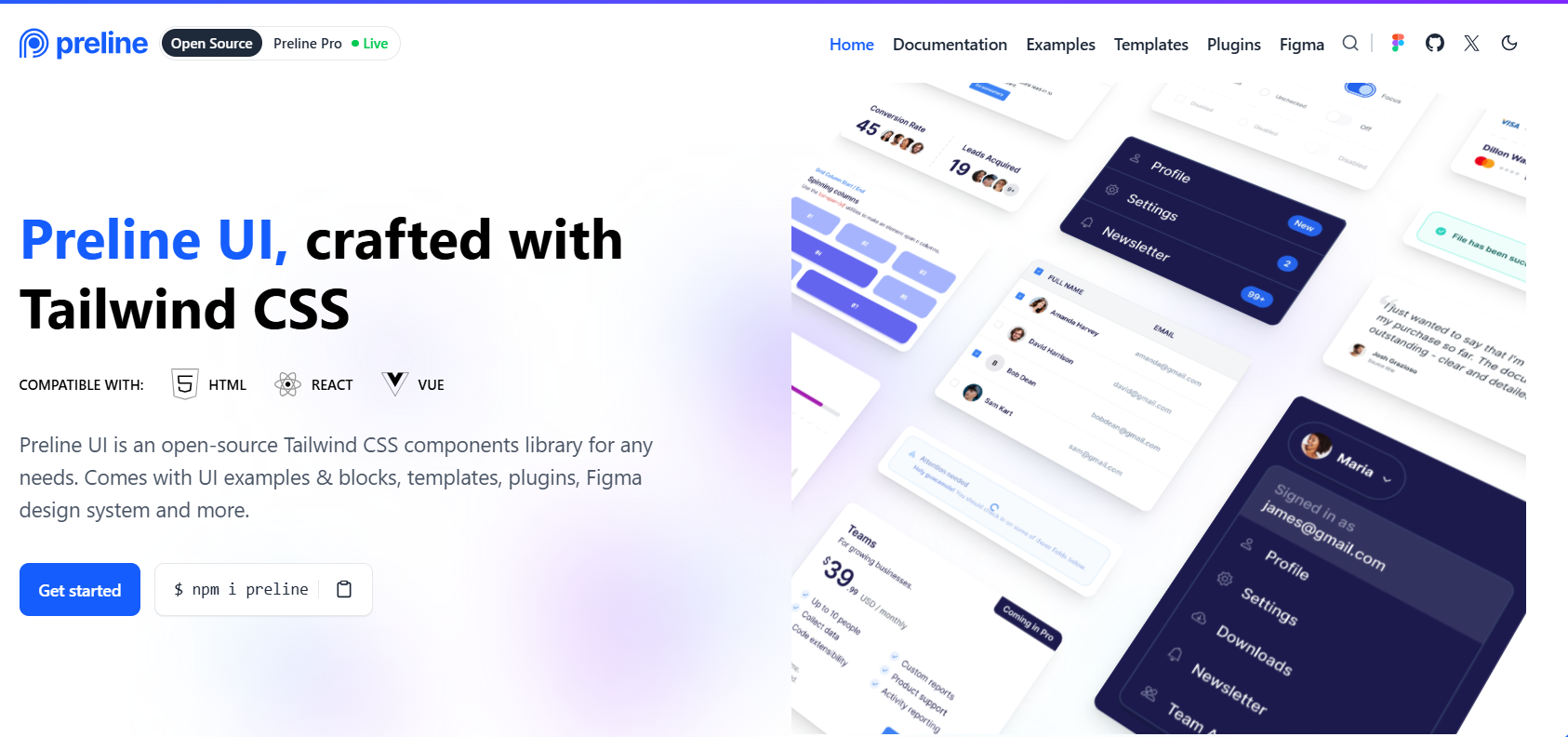
Preline UI
A growing library of Tailwind components — plug-and-play pieces to help you ship faster without starting from scratch.
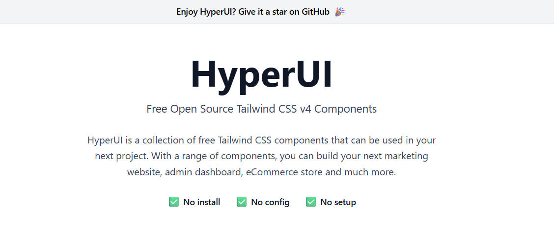
HyperUI
Free, ready-made Tailwind components — just copy, paste, and get on with your life.
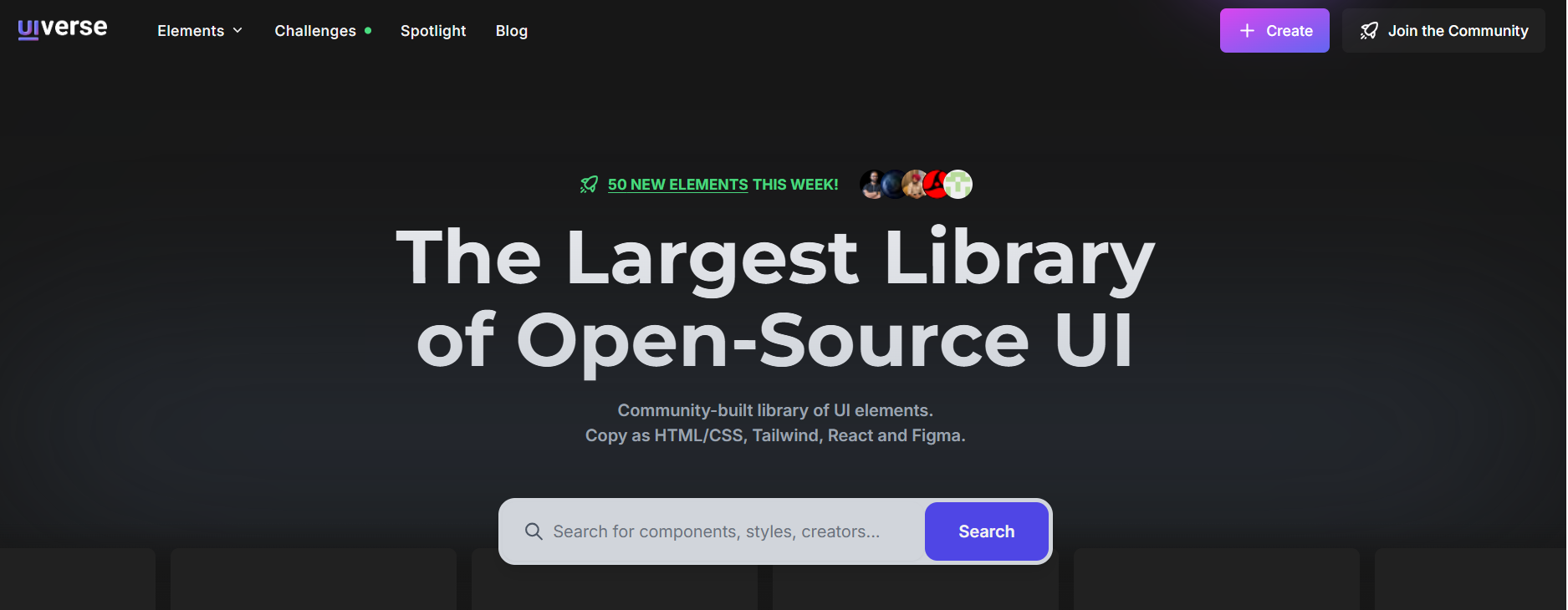
Uiverse
A community-driven collection of fun and creative components — mostly buttons, cards, and effects made with CSS or Tailwind.
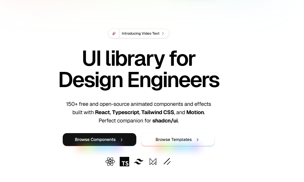
Magic UI
Flashy and animated React + Tailwind components — perfect if you want your UI to actually impress people.
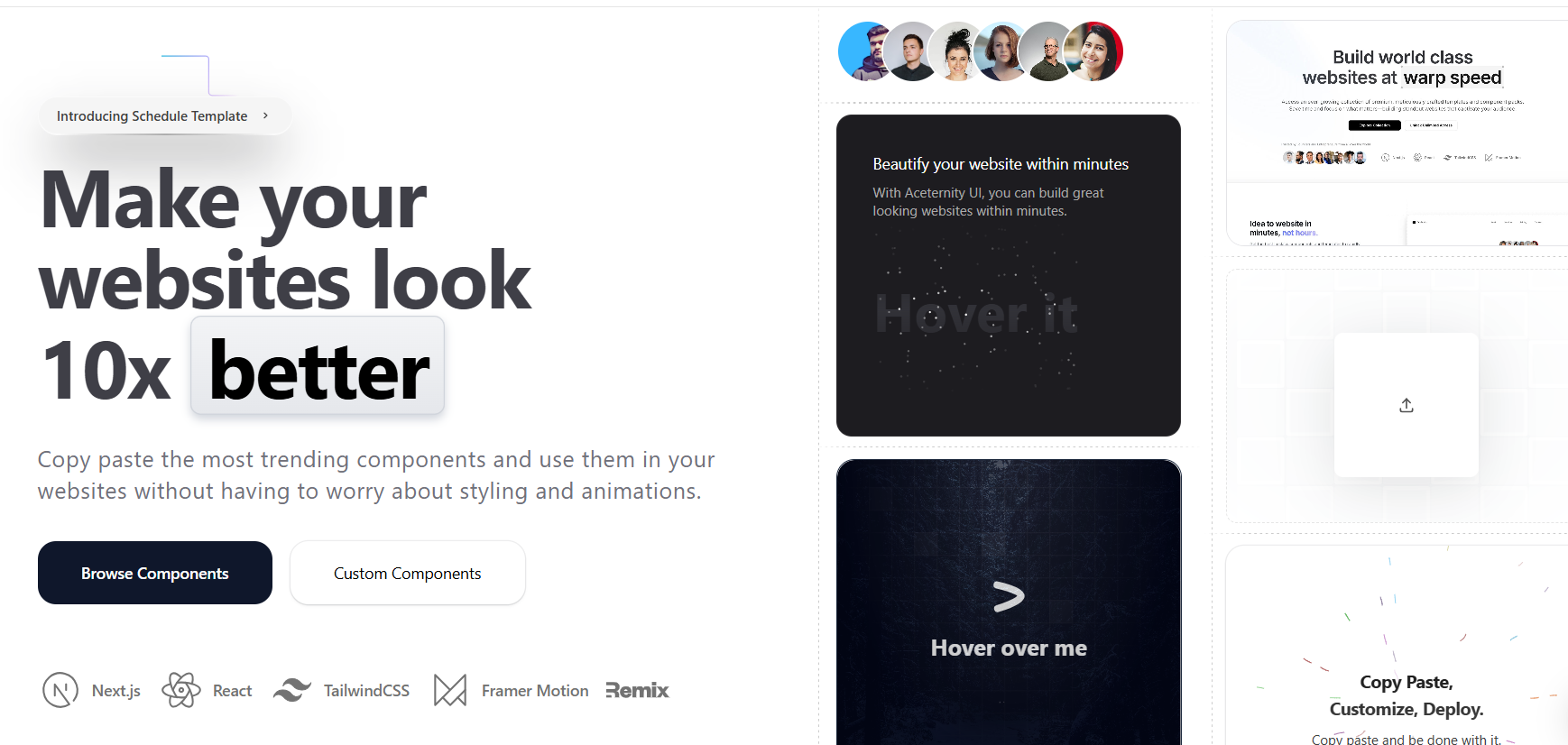
Aceternity UI
Modern, stylish React + Tailwind components that stand out. Packed with eye-catching designs.

Easy Frontend
Like a playground of HTML/CSS/JS code snippets with real-world use cases — awesome for learning or building fast.
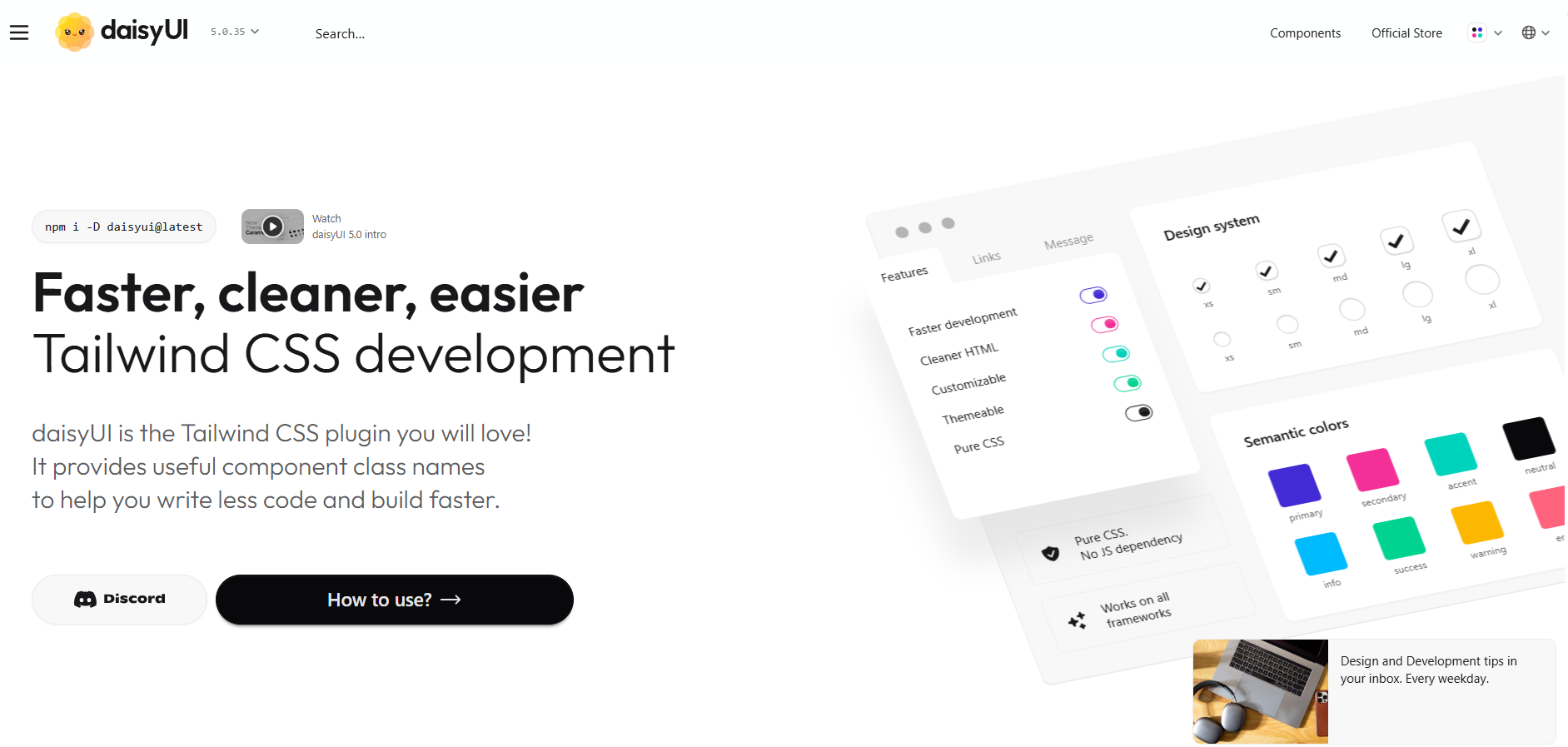
DaisyUI
Adds styled components to Tailwind with themes built-in — no more manual class juggling for buttons and inputs.
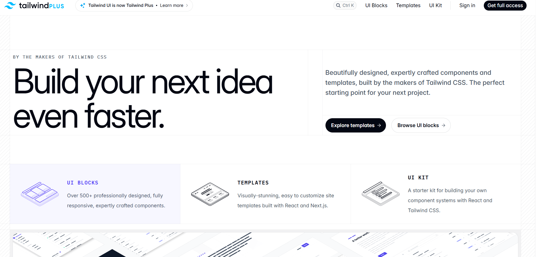
Tailwind UI
Premium components made by the Tailwind team. Super polished, but comes with a price tag.
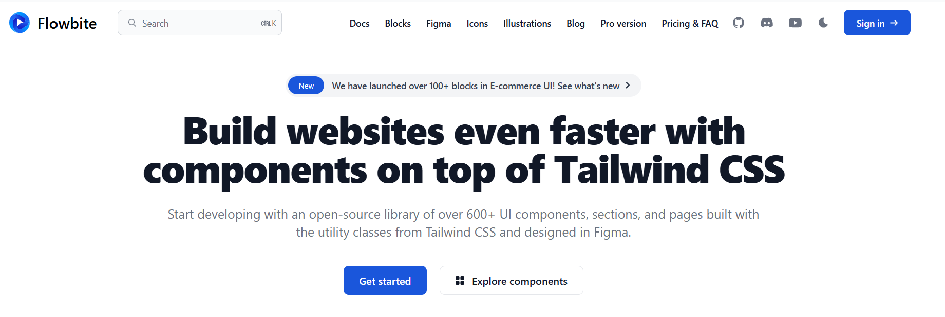
Flowbite
Tailwind components with a focus on accessibility and dark mode. Bonus: they come with matching Figma files.
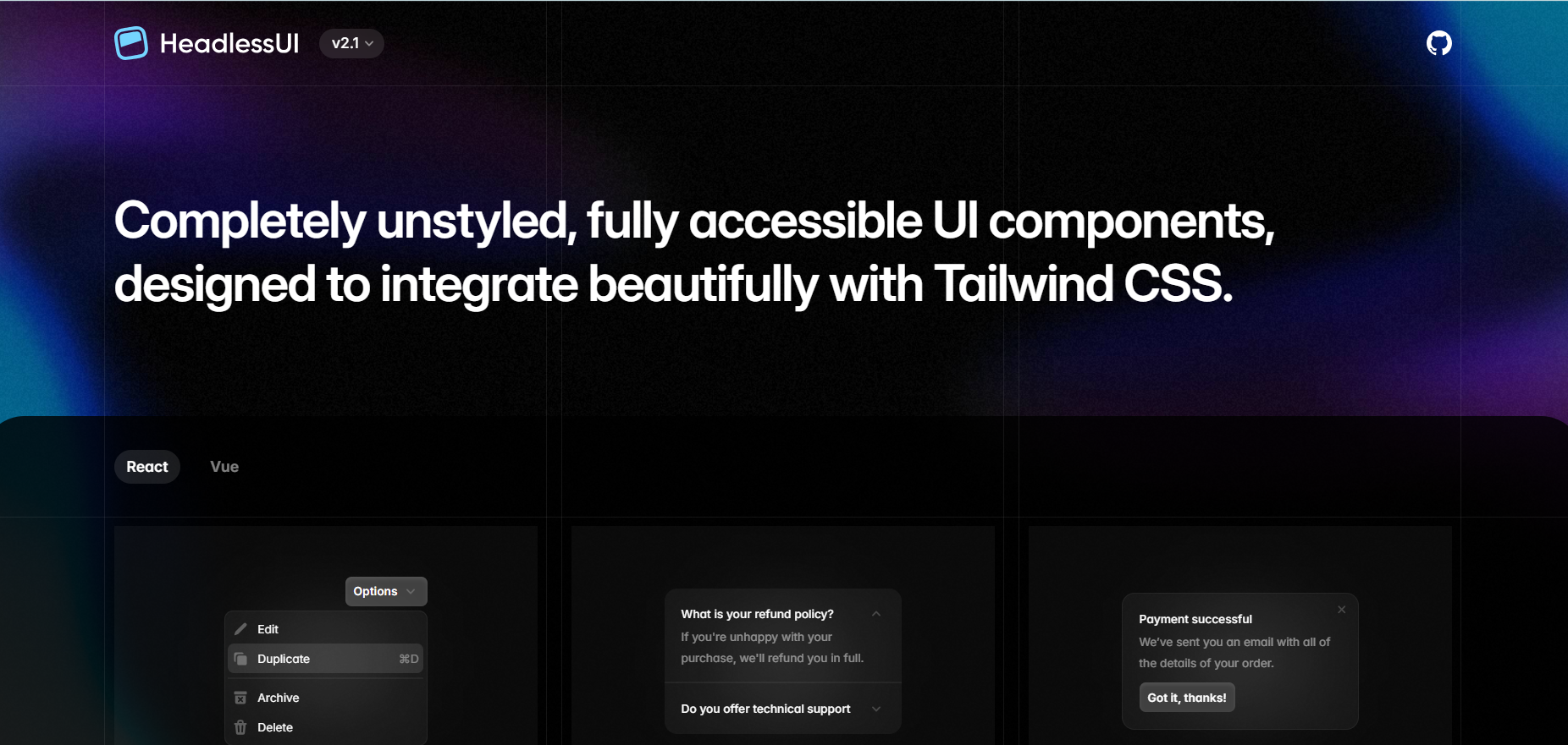
Headless UI
Unstyled but super accessible UI components — great if you want full control over styling using Tailwind.